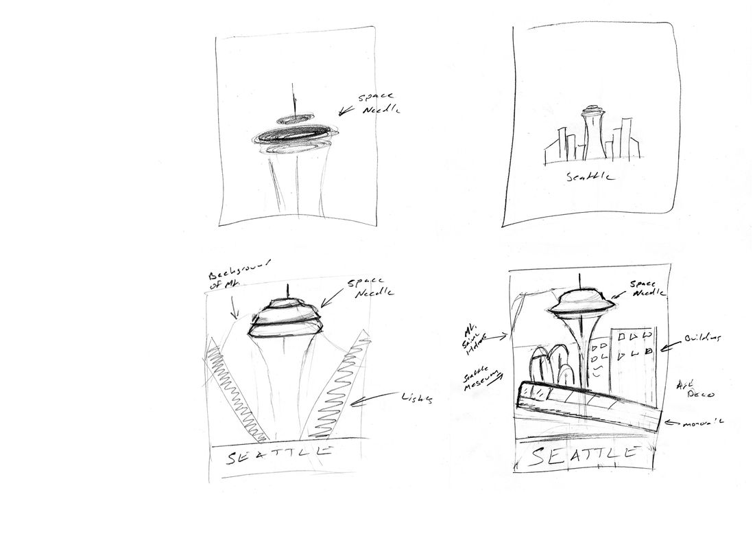
Seattle Poster
This concept draws inspiration from the Art Deco style but in the form of a travel poster. The location is based on Seattle and its iconic architecture. Embracing a vintage aesthetic, the design highlights the clean geometric shapes and bold structured forms that reflect the elegance and charm of the Art Deco era.
Project Type
Travel Poster
Purpose of Project
Solo Student Project
Date
April 2020
Color Palette & Typography
The color palette represents Seattle’s landscape and mood. With the city surrounded by the waters of the Puget Sound and often wrapped in deep blue evening skies, I used various shades of blue to evoke a calm, atmospheric feel. To add contrast and energy, I included hints of yellow to represent the warm glow of lights shining from the city's buildings.
For the typography, I selected a sans-serif Jost Semibold font for the title, as its bold and clean appearance immediately highlights the travel destination and grabs attention.


